7 Effective Tips To Create Realistic Drawings
Have you ever tried to create a drawing of an object and felt frustrated because it just didn't look realistic? If so, this blog post is for you. We’re going to give you 7 great and effective tips to create realistic drawings. From understanding perspective to shading techniques, there is something here for everyone. There’s no better time than now to learn how to make those drawings of yours pop. Let’s get started!

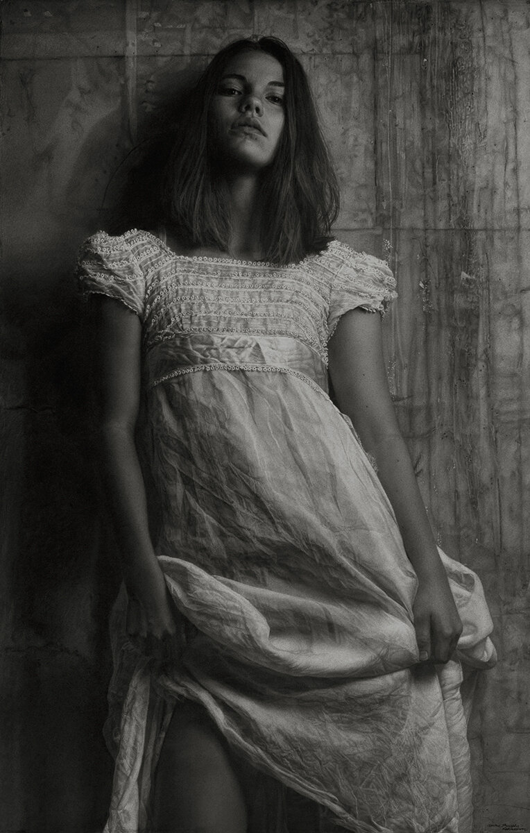
“Angel” //Graphite on Art Paper// by 3rd Edition Finalist, John Weiser
Use A HIGH-QUALITY REFERENCE PHOTO
Quality starts with the reference photo you use because without even realizing it, using a poor-quality reference can make your process unnecessarily difficult as lots of crucial information is lost. Now, we know that some artists view using photo reference as a big no-no but honestly, it works wonders for enhancing your eye-to-hand communication and a great option if you need inspiration and acuity but don’t have access to live subjects. A high-quality reference consists of balanced light play between highlights and shadows and very good resolution so that if need be you can actually zoom into the image and still see detail without pixelation. Whereas, poor quality reference photos can portray any of the qualities listed below:
• underexposure or overexposure which causes you to lose integral information about the light play and shadows that help bring realism to your drawing. Under and overexposure can cause the to appear unrealistically intense or washed out so that it’s harder for you to capture the true colour values of the image and produce an authentic representation of reality.
• blurryness which creates an exaggerated softness in the photo and as it’s your preference you need to be able to clearly see the distribution of sharp and soft elements instead of a wish-washy, unsolvable blend
• flat light or extreme shadows which makes you risk losing the 3 dimension volume that characterizes realism and the world around us
• Too small in size because you’ll be straining to see or even simply won’t be able to see the necessary details you need to capture in your drawing. We suggest using an image that’s no smaller than 6 x 8 inches.
However, we understand that sometimes you don’t have any other option and have to resort to using a poor quality reference photo but here’s how you can still make the best out of it because (believe it or not) just like magicians, you have the capabilities to make something out of nothing. Artist Karin Wells outlines her approach to salvaging a poor quality reference image called the "Ansel Adams" approach which uses techniques such as desaturating and posterizing to emphasize shades of tones.
Firstly, she made a layer (stacked layers of transparent components of an image) in Photoshop which will allow you to alter and adjust the image, colours and so much more without making changes to the original image. She stated that she used a Gaussian Blur Filter (12 pixels) and adjusts the Brightness/Contrast to +15/+15 when she was editing a reference photo of a young boy’s portrait.
Then, she faded the layer to about 35% and flattened the image. She explained that “the result can sometimes give you a soft and glowing effect with softer transitions from light to shadow - much like an Ansel Adams photograph”. She conveyed that what she had done was posterize a copy of the original grayscale photo to 5 levels above so that she could clearly see patterns of light and shadow and a good solid abstract composition.
Wells stated that when an image is posterized at 13 levels, you have more precision when it comes to viewing the distribution of value from highlight to deep shadow which would have normally been merged and blended together in a photograph. For the child’s eyes, she added light to the iris and moved the highlights up to make the eyes look more realistic.
She continued by stating “the source light comes from the upper right and the light (not highlight) reflected in the eyes is an opportunity to get the "color" right.” Thereafter, she used her trick of raising the existing highlights in the eye to finish the digital process so that she can see all the realistic elements in a poor-quality reference image.

“Denis” //Charcoal// by 3rd Edition Finalist, Jennifer Globush
2. DRAW THE OUTLINE OF YOUR SUBJECT
Drawing an outline of your subject is the first step to creating a work that captures their likeness. It’s difficult and surely a skill to be able to examine your subject or reference photo and represent your perception of the contours, but practice really does help because all in all, it is a useful initial step for building the foundation of realistic drawings. It’s also your guide to proportion, depth, and field of view and will give you time to think about what colors and texture may work well with your piece, as well as how much space should be allocated for each object in the background or foreground. To start the process of drawing your outline, you should decide on your preferred outline technique. For example, you can follow the Andrew Loomis method which focuses on the construction of the head by deconstructing the components of the skull such as its spherical shape and the angular sharper block-shaped jaw and cheekbones. Or, you can opt for the Grid method which breaks down the subject’s outline into a grid filled with small squares. Another technique that’s best known for producing accuracy is the Proportional Divider method which utilizes a proportional divider tool to represent the original proportions and even larger and smaller proportions of the reference photo to still carry across realistic size relations. And that’s not all… there’s also the freehand method which as its name suggests is a sketching style that doesn’t incorporate the use of measuring instruments which can make for an expedited process. With this technique, observation is crucial as you use your pencil, pen, and rubber to capture them.

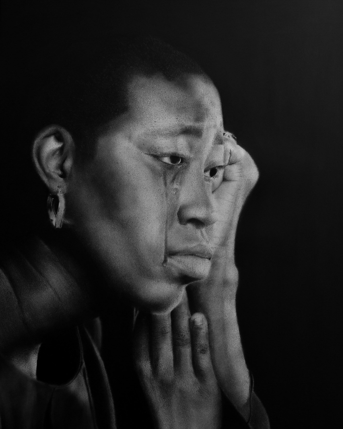
“Cover your Mouth” //Charcoal// by 2nd Edition Finalist, Asiah Thomas-Mandlman
3. FOCUS ON PROPORTION
To create realistic drawings, it is important that the proportions are as accurate as possible by focusing on the size relationship between objects in the foreground and background and ensuring that all three dimensions are also accurate. The first dimension of a good proportioned drawing would be the width to height ratio, where both proportions should match up evenly so there isn't any distortion along the straight lines that extend from left to right on an easel or paper. Next, you need your depth ratios similar distances apart and approximately as wide as they are tall with light and dark shades close together for shading effect. And finally, make sure everything has shadows when necessary but don't overdo it because too much shadow can take away from what's being drawn if not used correctly!
It takes some time and practice before creating realistic drawings becomes second nature, but once you have those basics down pat focusing on details will become a whole lot easier.

“Gorecki” //Graphite and Charcoal// by 3rd Editon Submitter, Kirsten Walsh
4. PAY ATTENTION TO YOUR LINEWORK
Linework is quite important in realism because you shouldn’t see visible or stark lines in your piece as this is not a realistic effect. In fact, in reality, we don’t even perceive lines; rather, what we perceive is the end of colour, shadows, and gradient. Lines do not create the distinguishment between or delimit their environment in realism and this is why it’s essential not to have visible lines in your realistic drawings. Putting less pressure when drawing lines will help them to be a lot less visible because more pressure in your grip will produce bold darker lines.

“No Turning Back” //2B Pencil on 300 series Bristol// by 2nd Edition Finalist, Kevin Nichols
5. ADD SHADING AND SHADOWS
Shading and shadows are imperative because they bring depth and that 3-dimensional element that makes a piece more lifelike and less flat. They create areas that recede from light sources which help to shape out flat planes like faces, buildings, or trees. The contrast between what should be dark versus bright also makes objects pop off the page as well giving them impactful qualities such as formidability. You can try shading techniques such as blending in which you start with a softly shaded object with the use of an overhand grip. Then, blend the transitions with a blending stump so that there isn’t a drastic separation. After, you’re going to establish your light source and its direction so that you add darker layers of shadows on the opposite side. Continue by blending the transitions but not too much to the extent that there is no longer contrast between the shadows and highlights. Create a cast shadow and again use a blending stump to blend the transitions in the cast shadow. Another technique is hatching in which you use parallel lines (some straight and others slightly curved) that point in the same direction. When the lines are closer together and thicker in hatching, they appear darker. Meanwhile, the sparser and less pressure used to create lines makes them appear lighter which is good for highlighted areas. Try to make the transitions as gradual and smooth as possible for the best and most realistic outcome.
“Casey Voodoo Child” //Sanded Charcoal// by 3rd Edition Finalist, Annie Murphy Robinson
6. CHOOSE THE RIGHT TOOLS
Your tool is just as important as your technique. When you’re shading, a good choice pencil to start with is a soft (B) graphite pencil but it depends on the look you desire of course. These work well for achieving medium to light shading and the 2B pencil is best-suited for medium to dark shading. If you desire darker shading, you can try 4B because it’s still soft and doesn’t get dull quickly even with its intensity unlike 6B which is also good for intense deep dark areas but it does get blunt much faster and can give off a grainy effect. For medium to darker shading, you can also try using both H (hard) and B pencils by first shading your area as a means of making the grain smooth before you incorporate your soft pencil. The key is to experiment and play around to see what best works for you and find your preferences when it comes to your pencils and shading.
If you’re using charcoal, it’s useful to start with a light-grade charcoal pencil because it’s light and ideal for sketching your outline. When you’re moving onto basic tones, you can opt for a soft charcoal crayon as it can smudge well and is versatile enough to create light and dark tones. Now, it’s time to develop and build up tones and various details and a handy tool is a sharp charcoal pencil and finally, to strengthen your tones, try integrating a soft charcoal crayon along with a sharp charcoal pencil.
“Embrace the struggle” //Pencil and charcoal// by 4th Edition Submitter, Femi Ikotun
7. KEEP YOUR PENCILS SHARP
This sounds like a given, right? But, seriously, it is super important to keep your pencils sharp, or else it can hamper the aforementioned processes of paying attention to your linework so that there aren’t any visible or stark lines and creating smooth transitions between values. To keep them sharp you can use sandpaper. What you want to do is use fine sandpaper. The higher the grit number, the finer the sandpaper so you can try values such as 150, 180, and 220. This will allow you to control the amount of lead that you remove at once. Remember to be gentle when sanding in a horizontal motion because you don’t want to break the core.
We hope that these tips help you to create exceptional realistic drawings that will resonate with your audience. Feel free to comment more tips that you use to help other fellow emerging artists!